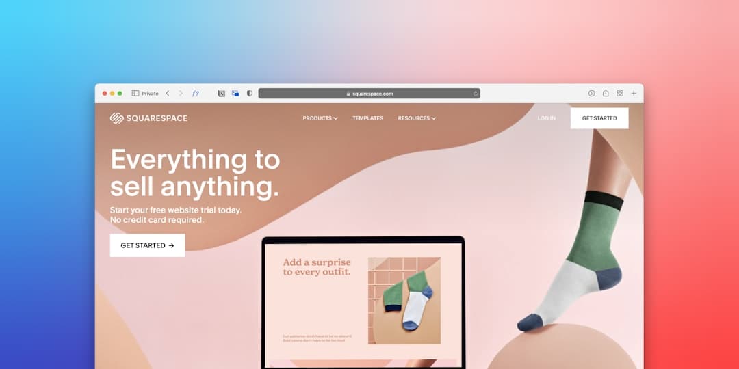
Your homepage often gets only a few seconds to show someone they're in the right place. When a potential client lands on your site, they're asking one question: "Is this for me?"
If they can't answer that quickly, they'll click back to Google and try the next result.
The good news? You don't need fancy animations or clever design tricks. You need clarity. Let's walk through what actually belongs on your homepage — and what you can safely leave off.
Start With What You Do and Who You Help
This sounds obvious, but you'd be surprised how many homepages bury this information. Your headline should tell visitors exactly what you offer and who it's for.
Compare these two examples:
Vague: "Helping you achieve your potential"
Clear: "Sports massage therapy in Bristol for runners and cyclists"
The second one tells you what you need to know at a glance. If you're a runner in Bristol with a sore hamstring, you know you're in the right place.
Write your headline like you're explaining your business to someone at a party. No jargon. No clever wordplay. Just plain English.
A Photo That Shows You're Real
People buy from people. A photo of you — or your team, or your workspace — helps build trust in a way text alone often can't.
This doesn't need to be a professional headshot (though those help). A clear, well-lit photo where you look approachable works perfectly well. If you're a therapist, show your treatment room. If you run a café, show the space.
Avoid stock photos of smiling people in suits shaking hands. Visitors can often spot them, and they make your business look generic.
What Makes You Different
Your visitors are probably comparing you to two or three other options. Give them a reason to choose you.
This doesn't have to be revolutionary. Maybe you offer evening appointments when others don't. Maybe you've been doing this for fifteen years. Maybe you specialise in a particular niche.
Pick two or three things that set you apart and mention them clearly. For example:
- "Evening and weekend appointments available"
- "Specialising in anxiety therapy since 2012"
- "Free parking on site"
These small details help people picture working with you.
Social Proof (Even Just a Little)
For most businesses, testimonials help. A few genuine quotes from real clients can tip someone from "maybe" to "yes."
You don't need dozens. Three solid testimonials are better than twenty generic ones. With the person's permission, include their name and, if possible, a photo or their business name. This makes them feel real. Only ever use real words from real clients: fake reviews, or real ones edited to change their meaning, are banned under UK consumer law (CMA guidance).
If you're just starting out and don't have testimonials yet, that's okay. You can add them later. In the meantime, mention any relevant qualifications, memberships, or years of experience.
If you're a therapist or counsellor, check your professional body's rules first. The UKCP's Code of Ethics, for example, says members must not include client testimonials in any advertising, and a public quote can reveal that someone has been in therapy. Your qualifications, memberships and a clear description of how you work can do much of the same job without that risk.
A Clear Way to Get in Touch
This is where many homepages fall down. Someone's interested, they want to reach out... and they can't find the contact details.
Your phone number and email should be visible without scrolling. Put them in the header. Put them in the footer. Put them in the middle of the page too.
If you want people to fill out a contact form, make sure it's short. Name, email, and a message box. That's it. Each extra field tends to put a few more people off.
What You Can Skip
Here's what you don't need on your homepage:
A slider with multiple images. They can slow your site down, and visitors often skip past them. One strong image usually beats five rotating ones.
Your full company history. Save that for your About page. Your homepage should focus on what you can do for the visitor, not your journey since 2008.
Walls of text. People scan websites; usability research suggests they read only a small part of each page. Use short paragraphs, bullet points, and clear headings.
Autoplay videos or music. Few things make someone close a tab faster.
The One Question to Ask Yourself
When you look at your homepage, ask: "If someone landed here knowing nothing about my business, would they understand what I do and how to contact me within ten seconds?"
If the answer is yes, you're in good shape. If not, simplify.
Your homepage isn't about impressing people with design. It's about helping them take the next step — whether that's calling you, booking an appointment, or sending an enquiry.
Keep it clear. Keep it human. Keep it focused on them, not you.
Want a website that's built for you and then kept up for you? Elite Rose Digital sets up websites for small UK businesses from £249, then looks after them from £49 a month (12-month minimum). Tell us what you need at eliterose.digital.